Usability Testing Firefox Customization
Overview
A study to investigate the usability of the customization feature for Firefox, an open-source browser focused on user agency and control.
Sponsor
Mozilla
Jennifer Davidson, UX Researcher
Duration
11 Weeks
Contribution
Interaction Mapping
Heuristic Analysis
Usability Test Moderation
Synthesis
Deliverables
Research Proposal
Study Guide and Test Kit
Research Report
Research Presentation
Team
Yanrong Chen
Sara Cagle
Luis Enrique Torres
The Feature
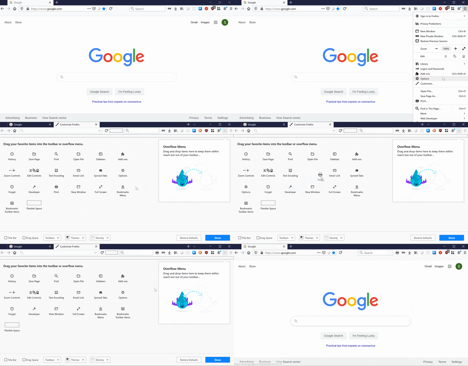
We were tasked with evaluating the usability of the Customization Canvas within Firefox. The customization canvas is a feature-rich drag and drop page in which allows users to change the appearance and functionality of their browser to meet their individual needs.
The customization canvas.
Research Objective
While user agency and control is a central tenant of Mozilla’s mission, they had never examined the usability of this feature and had no telemetry on its usage. We were therefore tasked with exploring the usability, discoverability, and use cases of this feature for Mozilla’s diverse audience.
Usability Test
Are users able to use the customization mode within the Firefox browser to complete a scenario-based goal with minimal errors?
Semi-Structured Interview
What browser features are important to users to be able to change or customize?
In what scenarios would users want to customize their browser toolbars?
The Challenge
Customization features are particularly difficult to test because:
They are not the primary interest of the user, but instead a secondary interest that may help a subset of users take better advantage of the system.
They require active involvement from the user in that the user must be able to turn a particular problem or challenge into a set of actions.
This feature lends itself for multiple iterations or retries, meaning it is not always a linear process.
The Study
Participants
Firefox’s target audience is highly diverse. The usability testing relied on recruiting participants from many different backgrounds to try and replicate the variety of real-life users. However, in order to scope the project to a maintainable size, our team adhered to the following criteria:
Sessions
Sessions were completed in testing rooms on the UW and Microsoft Redmond campus. Each session lasted about 60 minutes and followed a standardized protocol to ensure consistency across participants.
Protocol
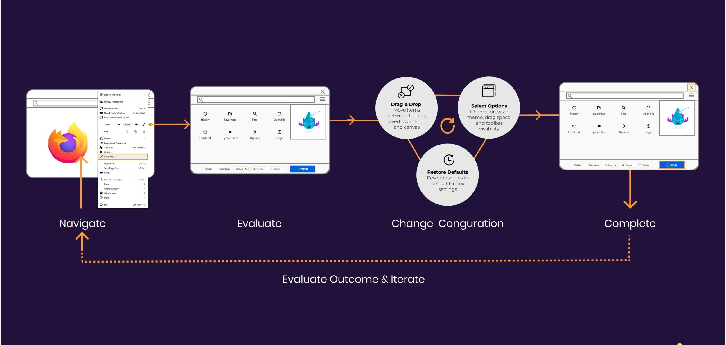
Each session followed the following structure:
Moderated Usability Test. broken into 4 discreet scenario-driven tasks:
Adding function to toolbar.
“Imagine that you frequently print pages found on the Internet. How could you change your toolbar configuration to print pages with one click?”
Reconfiguring toolbar.
“Internet browser Chrome has its toolbar ordered in this configuration: back arrow, front arrow, refresh arrow, search bar, plug-ins, overflow. I want you to imagine you have recently started using the Firefox Internet browser after using Chrome, but the toolbar is different and unfamiliar. How could you change your Firefox browser to match the toolbar configuration that you are used to?”
Decluttering toolbar.
“Imagine your Firefox toolbar is cluttered with plugins that you no longer use. How would you reduce this clutter in your toolbar?”
Changing overall appearance through themes.
“You often browse the Internet at night, and Firefox’s white background is too bright for your eyes. How would you change the color of your browser (from within the browser) to better suit your night-time browsing?”
Post-task (SUS) questionnaire to collect perceptions of ease of use and value of the feature.
Semi-structured Interview. Identify scenarios that may bring value to the customization feature from participants perspective.
Analysis
Task Completion (Pass/Fail)
Impact Score (Blocker, Major, Minor, Suggestion)
SUS Score
Affinity Diagramming
Results
Results were organized into severity levels to communicate the relative necessity of acting on our findings.
Low Severity.
While there is a benefit to fixing this issue, not addressing it immediately will not significantly affect its usability.
Medium Severity.
Fixing this issue should provide significant usability benefits to the product.
High Severity.
It is imperative to address this critical usability deficiency.
Dragging Interface Signifiers
Users of all technical levels found the dragging interface challenging. While there is a small text field indicating that users must drag to the toolbar, users had mental models that adhered to clickable or toggleable interfaces. Users either gave up or used experimentation to complete the task. No users dragged the icons as their first interaction with this interface.
“I don’t know why clicking on ‘Options’ didn’t work, I expected it to do something.” -P3
2. Information Hierarchy
Once users found their way to the customization canvas, there were certain aspects that drew their attention more than others. Viewers seemed to be focused more on the top of the page, looking at the icons and overflow menu rather than the options at the bottom.
“I don’t see an option to change themes on this page [Customization Canvas)… I’m going back to the home page.” -P5
3. Discoverability
When they were not able to find the Customization feature, our less technically capable users were completely lost. They wanted to search for help on google because they were completely unsure of where to start. For this subset of users, the customization documentation is nested under many different tabs and is not easily searchable via a browser.
“I have no idea where to go from here… can I search on Google?” - P2
4. Feature Distribution
There is a partial overlap in features between the three UIs: There are features that are only available via Add-Ons or Themes; there are features that are available both via Add-Ons (or Themes) and the Customize UI. And there are features for Add-Ons and Themes that are only available via the Customize UI.
Recommendations
Evaluate dragging UI cues. Consider changing the dragging interaction to a toggle-able or clickable interaction as this better aligned with user’s mental models.
Reduce visual distance. Offer clearer cues so users can locate important features such as ‘Done’ and others. Consider an overall re-design of the Customization UI that considers information hierarchy.
Help and Documentation. Provide easily searchable help or a guided on-boarding experience to help those new to the customization mode.
Redistributing functionality. Remove some overlapping features from the Customize, Themes and Settings interfaces. This will simplify navigation for users by allowing them to form mental models of what functionalities are available where.


